Understanding White Paint Undertones: How to Choose the Right White for Your Home
This post may contain affiliate links · This blog generates income via ads
Choosing white paint sounds easy until you bring home a few samples and realize they all look completely different on your wall!! One white feels creamy, another looks grey, and another suddenly turns icy blue by evening. That’ s because white paint is almost never just white. Most white paints have undertones that lean warm or cool, and those subtle hints of colour can change the whole feel of a room. Paint brands like Sherwin-Williams and Benjamin Moore both note that warm whites usually carry red, yellow, or orange undertones, while cool whites often lean green, blue, or violet. They also recommend comparing swatches and sampling at home because lighting and surrounding finishes can dramatically change how white looks
In this post, you’ll learn what white paint undertones are, how to spot them, and how to choose the right white for your walls, trim, cabinets, or whole-home colour palette without wasting money on the wrong sample.

Quick Overview
Time: About 30 to 60 minutes to compare samples, plus a few days to test them in your space
Cost: Usually under $20 for sample pots or peel-and-stick samples
Skill level: Beginner
Tools: Paint swatches, sample pots or peel-and-stick samples, poster board or sample boards, painter’s tape, natural and artificial light
Materials List
Materials used for choosing white paint undertones:
- White paint swatches from your favourite paint brand
- Sample pots or peel-and-stick paint samples
- Foam brush or small roller
- White poster board or sample boards
- Painter’s tape
- Notebook or phone for photos and notes
You can usually find these at paint stores, home improvement stores, or through brand sample programs. Benjamin Moore recommends layering colour strips and comparing them at home, while brands like PPG also offer color tools and large swatches to help you test before you commit.
What Are White Paint Undertones?
White paint undertones are the faint background colours mixed into a white paint formula. They may look tiny on a swatch, but once the paint is on a large wall, those hidden tones become a lot more noticeable.
In simple terms:
- Warm whites usually have yellow, red, or orange undertones
- Cool whites usually have blue, green, or violet undertones
- Neutral whites usually have no obvious undertones
This matters because undertones affect mood, brightness, and how your room works with flooring, countertops, furniture, and natural light. Sherwin-Williams describes warm colors as cozy or energetic and cool colors as fresh and soothing. Benjamin Moore says lighting and room exposure can pull those undertones forward throughout the day.
Why White Paint Looks Different in Every Room
The same white paint can look soft and pretty in one room, then stark or dingy in another. That happens because white reflects everything around it.
A few things that change how white paint looks:
- Natural light: North-facing rooms often feel cooler, while south-facing rooms tend to bring in warmer light
- Artificial light: Warm bulbs can make whites look creamier, while cooler bulbs can make them look crisp or even slightly sterile
- Surrounding finishes: Wood floors, countertops, tile, and furniture can all bounce color onto the walls
- Time of day: Morning, afternoon, and evening light can all shift the look of the same white
This is exactly why sampling matters. A white that looks perfect in the store can look completely off once it is next to your fixed finishes and in your specific lighting at home!
Step-by-Step Tutorial
Step 1: Decide whether you want a warm or cool white
Start by thinking about the overall feeling you want in the room.
Choose a warm white if you want the space to feel cozy, soft, and inviting. This tends to work especially well with wood tones, beige textiles, warmer metals, and traditional or cottage-style decor.
Choose a cool white if you want the room to feel fresh, bright, and clean. This can work well in modern spaces, rooms with cooler stone or marble, and spaces where you want a crisp contrast.
Why this step matters: It helps narrow your options fast so you are not comparing twenty whites that do different jobs.
Tip to avoid mistakes: Do not start with the “most popular white.” Start with the feeling and finishes in your own home.
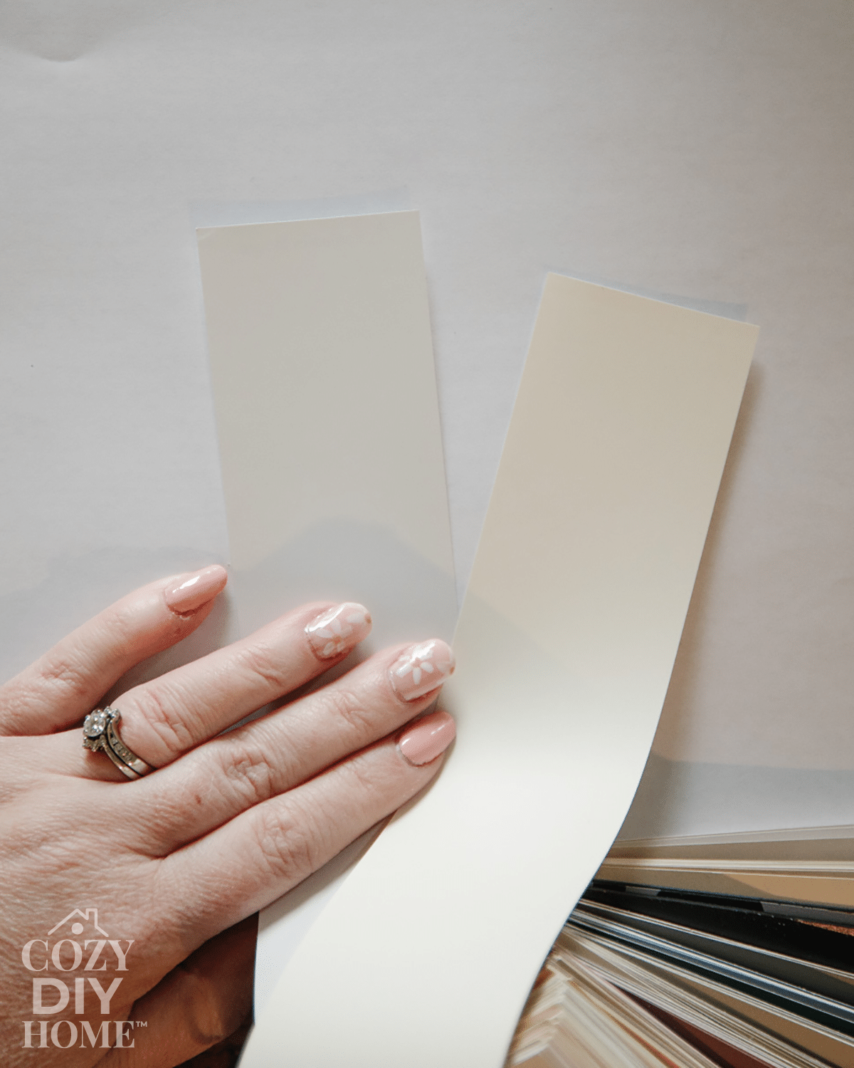
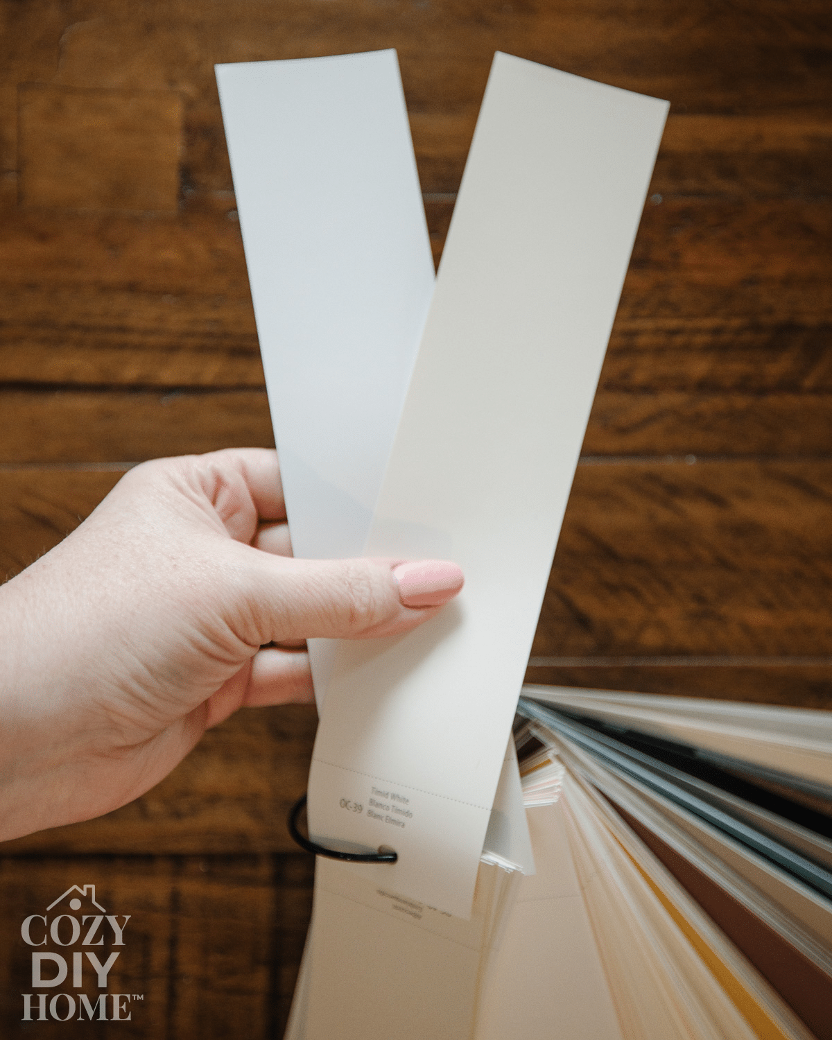
Step 2: Compare paint swatches side by side
Bring home several whites and hold them next to each other, not one at a time. White undertones are much easier to notice when you compare them directly.
Benjamin Moore recommends layering color strips to see differences in brightness and undertones. Sherwin-Williams also recommends looking at the darker shades on a color strip because the undertone is easier to spot there than on the palest chip. I’ve used this trick a lot!
Why this step matters: Undertones can be nearly invisible until you place two whites together.
Tip to avoid mistakes: Compare each white against a true bright white so hidden cream, grey, green, or pink undertones stand out more clearly. I like to use a sheet of white paper or a neutral white paint chip (like Benjamin Moore Chantilly Lace or Behr Ultra Pure White) for this.
Step 3: Look at the room’s fixed finishes
Before you buy paint, study the finishes that are not changing.
Look at:
- flooring
- countertops
- backsplash tile
- fireplace stone
- cabinets
- large furniture pieces
- trim color in nearby rooms
Why this step matters: Undertones should work with the things already in your space, not fight against them.
Tip to avoid mistakes: If you have warm wood floors or creamy stone, a stark cool white can feel harsh. If you have cool gray tile or marble, a yellow-toned white can look muddy.

Step 4: Sample on boards, not just the wall
Paint large sample boards or use peel-and-stick samples, then move them around the room.
This lets you test the color on different walls and see how it changes in different light. Many paint brands also offer visualizer tools and large swatches to help with this stage.
Why this step matters: A white can look different on each wall in the same room.
Tip to avoid mistakes: Make your sample bigger than you think. Tiny swatches rarely tell the full story. My preference is a swatch that’s at least 2 feet by 2 feet. (Use some poster board if you don’t want to paint your wall!)
Step 5: Check the samples morning, afternoon, and night
Look at your samples several times during the day. Paint colours can look wildly different at different times of day.
Natural light, artificial light, and room exposure can shift how white paint appears.
Why this step matters: The white you love at noon might feel blue at sunset or yellow at night.
Tip to avoid mistakes: Take quick photos throughout the day so you can compare the changes side by side.
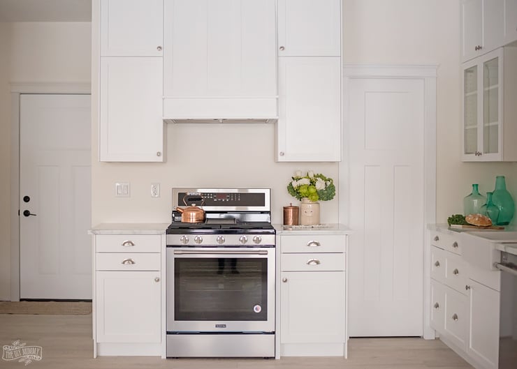
Step 6: Test the white next to trim, cabinetry, and decor
If you are choosing wall paint, compare it to your trim. If you are choosing cabinet paint, compare it to counters and backsplash. White-on-white combinations can clash when undertones do not match!
Why this step matters: Two whites can both be beautiful on their own but wrong together.
Tip to avoid mistakes: If one white suddenly makes another look dirty, pink, yellow, or blue, the undertones are probably fighting.
Common White Paint Undertones to Watch For
Yellow undertones
These whites feel warm, soft, and cozy. They can be beautiful in living rooms, bedrooms, and homes with lots of warm wood.
Red or pink undertones
These whites can feel warm and elegant, but sometimes turn rosy in the wrong light.
Green undertones
These can feel calm and subtle, but they may show up more strongly near landscaping, cool tile, or gray finishes.
Blue undertones
These whites feel crisp and bright, but can become cold in darker rooms.
Violet undertones
These often read as soft cool whites, though they can shift slightly grey or icy depending on the light.

Tips for the Best Results
Here are a few practical tips that make choosing white paint much easier:
- Do not trust store lighting alone. White paint needs to be tested in your actual room.
- Compare at least three whites. It is easier to spot undertones when you can see options side by side.
- Use large samples. Small chips are helpful, but large boards tell the truth!
- Check the undertone of your trim. White walls and white trim should feel intentional together.
- Watch trends, but choose for your home. Current design coverage from the National Association of Realtors points to growing interest in warmer off-whites and earthy neutrals, but your finishes and lighting still matter more than trends.
Styling or Usage Ideas
Once you understand white paint undertones, decorating gets so much easier!
Here are a few cozy ways to use that knowledge:
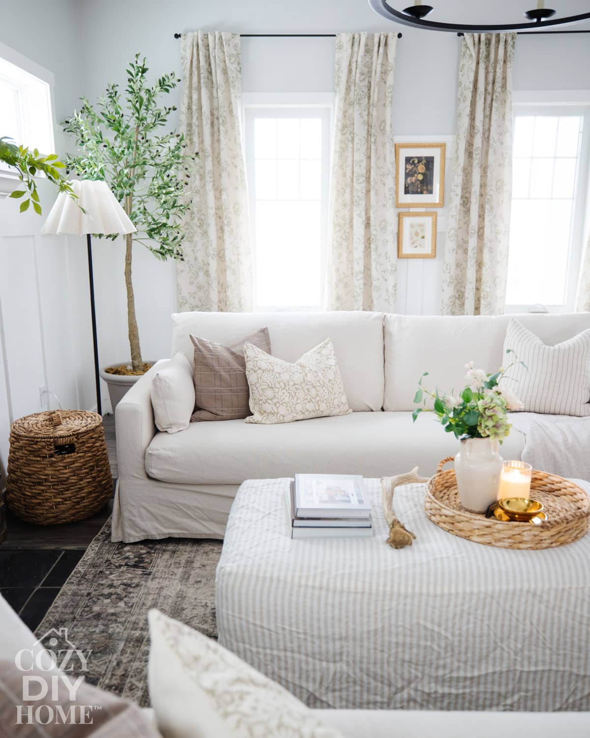
- Pair a warm white with wood frames, woven baskets, linen curtains, and antique brass for a soft collected look.
- Use a cool white with black accents, marble, polished nickel, and simple decor for a crisp modern style.
- Layer whites in the same room by using one white for walls and another for trim or cabinets, as long as the undertones work together. For example, I like using a lighter white paint on my trim, and a slightly darker one with the same undertone on my walls for a fresh, tone-on-tone look.
- Use warm white paint to make open shelving, vintage decor, and natural textures feel extra inviting.
- Try off-whites in small rooms where you want brightness without that stark builder-grade look.
Frequently Asked Questions
Look at it beside other whites and check the darker shades on the same color strip. Warm whites usually lean yellow, red, or orange, while cool whites lean blue, green, or violet.
Artificial lighting can pull warm undertones forward, especially if you use warm bulbs. Benjamin Moore notes that artificial light can make whites look warmer or cooler depending on the bulb and room conditions.
You can, but it may not look the same everywhere. Light exposure and surrounding finishes change how white appears from room to room.
Not always. Very bright whites can feel crisp and clean, but they can also look harsh in rooms with low light or warm finishes. Off-whites often feel softer and easier to live with.
Sometimes yes, especially for a seamless look. Just make sure the undertones match. If they do not, one white can make the other look dingy. I prefer to use a neutral, brighter white on my trim work paired with a slightly darker, warmer one on my walls.
Related Projects
If you enjoyed this post, you might also like:
- Painting by Numbers: A DIY Guide to Estimating Paint Needs
- 10 Paint Colors I’ll Use Again and Again: Best Paint Colours for Walls
- The Best Behr Black Paint Colours & Tips for Choosing One
- The Best Behr White Paint Colours & Tips for Choosing One
- Don’t Make These Mistakes when Choosing Paint Colors for Your Home
Understanding white paint undertones can save you so much frustration! Once you know how to spot warm and cool undertones, compare samples, and test them in your own light, picking the right white gets a whole lot easier.
The best white paint is not the trendiest one. It is the one that works with your home, your lighting, and the cozy feeling you want to create. Give yourself permission to sample a few options, trust what you see in your space, and take your time.
If you have a favourite white paint or a room that has been especially tricky, share it in the comments. I’d love to hear what worked in your home!
Pin Me: